Comparisons
Getting started
For this exercise you’ll use state-level unemployment data from 2006 to 2016 that comes from the US Bureau of Labor Statistics (if you’re curious, I describe how I built this dataset down below).
You should use an RStudio Project to keep your files well organized (either on your computer or on RStudio.cloud). Either create a new project for this exercise only, or make a project for all your work in this class.
To help you, I’ve created a skeleton R Markdown file with a template for this exercise, along with some code to help you clean and summarize the data. Download that here and include it in your project:
In the end, the structure of your project directory should look something like this:
your-project-name\
  08-exercise.Rmd
  your-project-name.Rproj
  data\
    unemployment.csv
To check that you put everything in the right places, you can download and unzip this file, which contains everything in the correct structure:
The example for today’s session will be incredibly helpful for this exercise. Reference it.
Again, you don’t need to make your plots super fancy, but if you’re feeling brave, experiment with adding a labs() layer or changing colors or modifying themes and theme elements.
You’ll need to insert your own code chunks where needed. Rather than typing them by hand (that’s tedious and you might miscount the number of backticks!), use the “Insert” button at the top of the editing window, or type ctrl + alt + i on Windows, or ⌘ + ⌥ + i on macOS.
Task 1: Reflection
Write your reflection for the day’s readings.
Task 2: Small multiples
Use data from the US Bureau of Labor Statistics (BLS) to show the trends in employment rate for all 50 states between 2006 and 2016. What stories does this plot tell? Which states struggled to recover from the 2008–09 recession?
Some hints/tips:
-
You won’t need to filter out any missing rows because the data here is complete—there are no state-year combinations with missing unemployment data.
-
You’ll be plotting 51 facets. You can filter out DC if you want to have a better grid (like 5 × 10), or you can try using
facet_geo()from the geofacet package to lay out the plots like a map of the US (try this!). -
Plot the
datecolumn along the x-axis, not theyearcolumn. If you plot by year, you’ll get weird looking lines (try it for fun?), since these observations are monthly. If you really want to plot by year only, you’ll need to create a different data frame where you group by year and state and calculate the average unemployment rate for each year/state combination (i.e.group_by(year, state) %>% summarize(avg_unemployment = mean(unemployment))) -
Try mapping other aesthetics onto the graph too. You’ll notice there are columns for region and division—play with those as colors, for instance.
-
This plot might be big, so make sure you adjust
fig.widthandfig.heightin the chunk options so that it’s visible when you knit it. You might also want to usedggsave()to save it with extra large dimensions.
Task 3: Slopegraphs
Use data from the BLS to create a slopegraph that compares the unemployment rate in January 2006 with the unemployment rate in January 2009, either for all 50 states at once (good luck with that!) or for a specific region or division. Make sure the plot doesn’t look too busy or crowded in the end.
What story does this plot tell? Which states in the US (or in the specific region you selected) were the most/least affected the Great Recession?
Some hints/tips:
-
You should use
filter()to only select rows where the year is 2006 or 2009 (i.e.filter(year %in% c(2006, 2009)) and to select rows where the month is January (filter(month == 1)orfilter(month_name == "January")) -
In order for the year to be plotted as separate categories on the x-axis, it needs to be a factor, so use
mutate(year = factor(year))to convert it. -
To make ggplot draw lines between the 2006 and 2009 categories, you need to include
group = statein the aesthetics.
Bonus task! Bump charts
This is entirely optional but might be fun.
For extra fun times, if you feel like it, create a bump chart showing something from the unemployment data (perhaps the top 10 states or bottom 10 states in unemployment?) Adapt the code in the example for today’s session.
If you do this, plotting 51 lines is going to be a huge mess. But filtering the data is also a bad idea, because states could drop in and out of the top/bottom 10 over time, and we don’t want to get rid of them. Instead, you can zoom in on a specific range of data in your plot with coord_cartesian(ylim = c(1, 10)), for instance.
Turning everything in
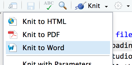
When you’re all done, click on the “Knit” button at the top of the editing window and create an HTML or Word version (or PDF if you’ve installed tinytex) of your document. Upload that file to iCollege.
Postscript: how I got this unemployment data
For the curious, here’s the code I used to download the unemployment data from the BLS.
And to pull the curtain back and show how much googling is involved in data visualization (and data analysis and programming in general), here was my process for getting this data:
- I thought “I want to have students show variation in something domestic over time” and then I googled “us data by state”. Nothing really came up (since it was an exceedingly vague search in the first place), but some results mentioned unemployment rates, so I figured that could be cool.
- I googled “unemployment statistics by state over time” and found that the BLS keeps statistics on this. I clicked on the “Data Tools” link in their main navigation bar, clicked on “Unemployment”, and then clicked on the “Multi-screen data search” button for the Local Area Unemployment Statistics (LAUS).
- I walked through the multiple screens and got excited that I’d be able to download all unemployment stats for all states for a ton of years, BUT THEN the final page had links to 51 individual Excel files, which was dumb.
- So I went back to Google and searched for “download bls data r” and found a few different packages people have written to do this. The first one I clicked on was
blscrapeRat GitHub, and it looked like it had been updated recently, so I went with it. - I followed the examples in the
blscrapeRpackage and downloaded data for every state.
Another day in the life of doing modern data science. I had no idea people had written R packages to access BLS data, but there are like 3 packages out there! After a few minutes of tinkering, I got it working and it’s super magic.