Space
Getting started
For this exercise, you’ll visualize the proportion of the world that uses the interent. You’ll use data from Max Roser’s Our World in Data project, which collects all sorts of interesting cross-national data. You’ll also use national shapefiles from Natural Earth.
Download these two data files:
-
share-of-individuals-using-the-internet-1990-2015.csv -
ne_110m_admin_0_countries.zip. This is the “110m Admin 0—Countries” shapefile from Natural Earth. It will download as a .zip file. Unzip the file and move the entirene_110m_admin_0_countriesdirectory into your data folder.
You should use an RStudio Project to keep your files well organized (either on your computer or on RStudio.cloud). Either create a new project for this exercise only, or make a project for all your work in this class.
To help you, I’ve created a skeleton R Markdown file with a template for this exercise, along with some code to help you clean and join the two datasets. Download that here and include it in your project:
In the end, the structure of your project directory should look something like this:
your-project-name\
  12-exercise.Rmd
  your-project-name.Rproj
  data\
    share-of-individuals-using-the-internet-1990-2015.csv
    ne_110m_admin_0_countries/
      ...
      ne_110m_admin_0_countries.shp
      ...
To check that you put everything in the right places, you can download and unzip this file, which contains everything in the correct structure:
The example from today’s session shows how to load and plot shapefiles and will be incredibly helpful as you do this exercise.
This can be as simple or as complex as you want. You don’t need to make your plot super fancy, but if you’re feeling brave, experiment with changing colors or modifying themes and theme elements.
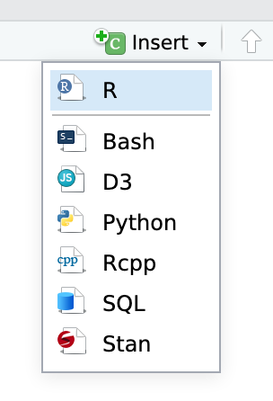
You’ll need to insert your own code chunks where needed. Rather than typing them by hand (that’s tedious and you might miscount the number of backticks!), use the “Insert” button at the top of the editing window, or type ctrl + alt + i on Windows, or ⌘ + ⌥ + i on macOS.
Task 1: Reflection
Write your reflection for the day’s readings.
Task 2: World map
Make a map showing the proportion of individuals in each country that had access to the internet in 2015.
- I’ve provided some starter code in the R Markdown file.
- You’ll want to fill each country by the
userscolumn. - Make sure you choose a good projection. See the “Projections and coordinate reference systems” section from the example.
Bonus optional extra fun: Use your comparison/time skills to show the change in internet access between 2000 and 2015, perhaps with facetting some years, or calculating ratios or proportions or percent changes
Bonus (optional) task!: Personal map
Draw your own map with your own points. This could be a map of places you’ve lived, or a map of places you’ve visited, or a map of places you want to visit. Anything!
The only requirement is that you find an appropriate shapefile (states, counties, world, etc.), collect latitude and longitude data from Google Maps, and plot the points (with or without labels) on a map. Use multiple shapefiles if you want—add roads, rivers, lakes, whatever.
Hint: Basically follow the code from the example in the section named “Making your own geoencoded data”
Turning everything in
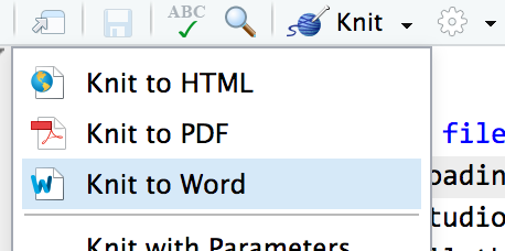
When you’re all done, click on the “Knit” button at the top of the editing window and create an HTML or Word version (or PDF if you’ve installed tinytex) of your document. Upload that file to iCollege.