Time
Getting started
For this exercise, you’ll visualize something over time. You can use whatever data you want. Use a dataset from a past exercise, use one of the built-in datasets like gapminder from the gapminder package, download stuff from the World Bank with the WDI package, or download stuff from FRED using the tidyquant package.
You should use an RStudio Project to keep your files well organized (either on your computer or on RStudio.cloud). Either create a new project for this exercise only, or make a project for all your work in this class.
To help you, I’ve created a skeleton R Markdown file with a template for this exercise, along with some code to help you clean and summarize the data. Download that here and include it in your project:
In the end, the structure of your project directory should look something like this:
your-project-name\
  11-exercise.Rmd
  your-project-name.Rproj
  data\
    WHATEVER.csv
To check that you put everything in the right places, you can download and unzip this file, which contains everything in the correct structure:
The example from today’s session shows how to get data from FRED, and the examples from sessions 8 and 9 show. You can also use gapminder, or any other dataset that includes a time-related column (so not mpg).
There’s no specific way you should visualize time. Show it as a line, or as bars, or with a heatmap, or with ridgeplots, or with whatever is most appropriate for the story you’re telling. You do not have to recreate the example from today. You’re free to do whatever you want!
This can be as simple or as complex as you want. You don’t need to make your plot super fancy, but if you’re feeling brave, experiment with changing colors or modifying themes and theme elements.
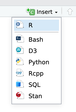
You’ll need to insert your own code chunks where needed. Rather than typing them by hand (that’s tedious and you might miscount the number of backticks!), use the “Insert” button at the top of the editing window, or type ctrl + alt + i on Windows, or ⌘ + ⌥ + i on macOS.
Task 1: Reflection
Write your reflection for the day’s readings.
Task 2: Visualizing time
Do the following:
-
Load some time-related data
-
Make a plot to show how that data changes over time.
-
Explain why you chose to visualize the data the way you did.
Turning everything in
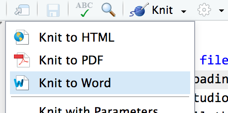
When you’re all done, click on the “Knit” button at the top of the editing window and create an HTML or Word version (or PDF if you’ve installed tinytex) of your document. Upload that file to iCollege.